Refreshing Propeller's identity. From indie boutique studio to modern tech agency.
Refreshing Propeller's identity. From indie boutique studio to modern tech agency.
MY ROLE
Identity design
Web design
MY ROLE
Identity design
Web design
CREATIVE TEAM
Propeller
CREATIVE TEAM
Propeller
PROJECT DATE
2015
PROJECT DATE
2015
COMPANY
Propeller
COMPANY
Propeller

Keeping it fresh
Keeping it fresh
Propeller was Founded in 2011. By 2015, the studio was growing in size and talent. We were evolving from a boutique studio servicing small businesses with branding, print and websites into large scale digital products for bigger clients. We had outgrown our humble beginnings and our identity needed to reflect that.
The goal was to create a visual identity that reflected Propeller’s creativity, high-tech capabilities, and above all else, capture the unique personality of our team. We wanted to put our people and our studio front and center.
Old Logo
Old Logo
Our original logo had a traditional hand crafted vibe, which served us well when working primarily in print and branding for local companies. However, it didn't capture the new techy direction of the agency. The fine linework didn't render well at most scales, and the logo felt heavy. It was a logo that looked backwards to the comfort and familiarity of the past. We were looking towards the future.
Our original logo had a traditional hand crafted vibe, which served us well when working primarily in print and branding for local companies. However, it didn't capture the new techy direction of the agency. The fine linework didn't render well at most scales, and the logo felt heavy. It was a logo that looked backwards to the comfort and familiarity of the past. We were looking towards the future.
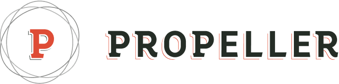
New Logo
New Logo
Our new logo paid respect to our origins by using the same letter shapes, but with a modern feel. We made it simpler, cleaner and lighter by eliminating the fine linework, chopping the serifs and embracing bright colour. This gave our logo a fresh modern look while still remaining familiar to those who knew us.
Our new logo paid respect to our origins by using the same letter shapes, but with a modern feel. We made it simpler, cleaner and lighter by eliminating the fine linework, chopping the serifs and embracing bright colour. This gave our logo a fresh modern look while still remaining familiar to those who knew us.

A new age
A new age
This new direction propelled (pun intended) us into a new era. While we continued to maintain our relationships with our smaller clients, we were able to land work creating apps and software for major international companies including Ryerson University, NRG Solar and Day & Ross Freight.
This new direction propelled (pun intended) us into a new era. While we continued to maintain our relationships with our smaller clients, we were able to land work creating apps and software for major international companies including Ryerson University, NRG Solar and Day & Ross Freight.